
Configure the Governance Portal's design settings
In the Design section, you can configure the general look-and-feel of the Widget from the perspective of layout, color, font and more.
Important! When configuring this section, make sure that you select Save on the tab you just configured before moving on to another tab/section.
To access the layout management settings:
- Go to
 Manage>Platform>Governance Portal.
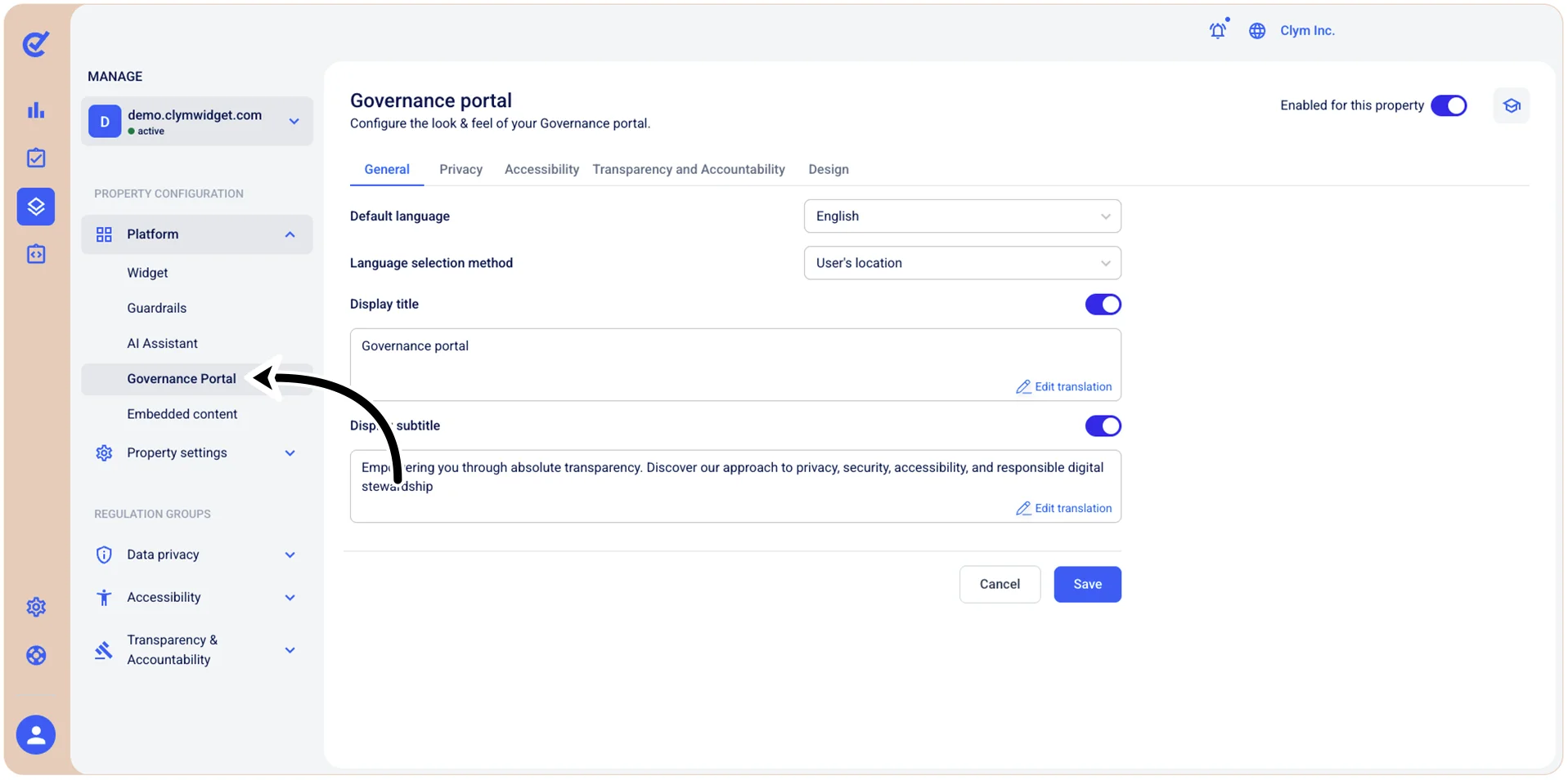
- In the Governance Portal section, go to the Design tab and configure the parameters, as follows. Depending on your selection at this stage, the UI features available to you may vary.
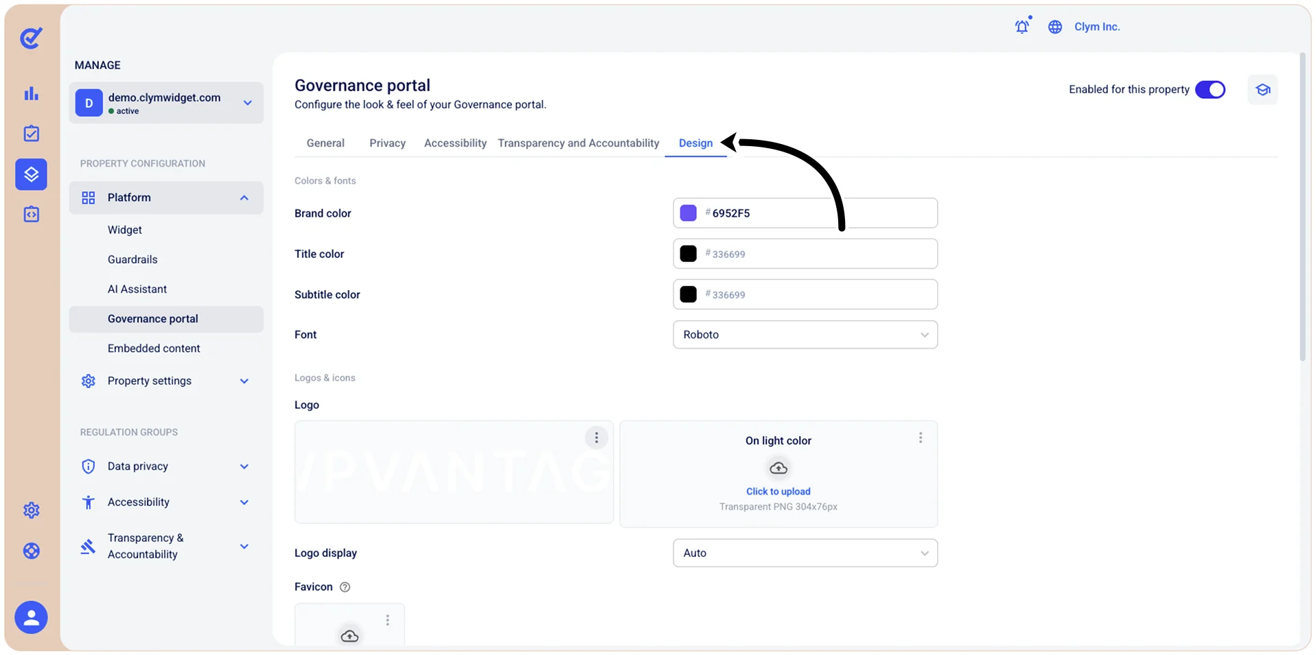
Under Colors & Fonts, configure the core visual identity of your Governance Portal:
- Brand color: Set the primary color used throughout the Governance Portal (buttons, highlights, and accents). Click the color swatch to open a color picker, or type a hex code directly into the field (for example,
#CE1010). - Title color: Define the color of the title displayed at the top of the Governance Portal by entering a hex value or by using the color picker.
- Subtitle color: Define the color of the text displayed at the top of the Governance Portal below the title by entering a hex value or by using the color picker.
- Font: Choose the typeface used across the widget.
Under Logos & Icons, manage the images and icons that represent your organization within the Governance Portal:
- Logo: You can upload two versions of your logo to make sure it looks great on any background - on brand color or light color. Make sure you observe the size requirements specified on screen.
- Logo Display: Configure when and how the logo appears within the Governance Portal (auto/light/dark).
- Favicon: Provide a square favicon for the Governance Portal.
Under Decorations:
- Hero section: Select how you want the hero section to be displayed: hidden/small/large.
- Hero background: Select how you want the hero background to be displayed: in branded colors/with an image you can upload/image with background overlay.
- Card type: Select the desired Governance Portal layout.
- Corner radius: Select how rounded you want the corners of the widget to appear.
- When finished, select Save.